In the traditional post-match interview after a rugby game, you’ll often hear a captain call it ‘a game of two halves’. While that is, of course, always literally true, what they typically mean is that the halves were very different. In particular, the team which dominated the first half often failed to do so in the second. The same seems to be true in the COVID-19 pandemic.
In the first half, the countries which dominated tended to be either: East Asian countries with early warning and experience in dealing with SARS or isolated rich countries with low risk tolerances. Those countries locked down ‘hard and early’, preventing the disease from becoming endemic. The obvious examples are Australia, New Zealand, Taiwan, Vietnam, and (after initially screwing it up royally) mainland China.
In the second half, the countries which are dominating have tended to be countries with high risk tolerances and impressive scientific expertise, which developed, tested, and administered the vaccines fast. Most prominent in this group are the United States and the United Kingdom.
Ideally, you would like to be in both categories: The first category have been spared the tremendous human costs of a deadly disease spreading through their societies. The second will be spared the economic costs of having to remain isolated from the rest of the world to prevent an outbreak.
I’ve made a graph, using data from the brilliant Our World in Data, to show the various combinations of death and vaccination rates. Death is used here as a stand-in for all forms of ‘disease-caused human suffering’, including hospitalisation and serious illness.
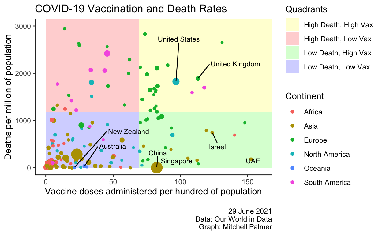
As you can see a strong positive relationship exists between death and vaccination rates: i.e., countries with lots of deaths have also tended to have more doses of the vaccine administered. There are likely a bunch of reasons for that. Two big ones occur to me:
- The most hard-hit countries have, for some reason (likely, population age structure and better reporting), been the rich world. The rich world has the money to buy vaccines.
- Countries suffering the most from the disease are obviously likely to priortise vaccination more than other nations.
The winners of the first half are in the bottom half of the graph, while the winners of the second half are on the right-hand side. Obviously, the green quadrant is where you want to be – with a low death and a high vaccination rate.
The quadrants are themselves defined with reference to the overall rich world’s rate of vaccination and death (respectively, 70 doses per 100 people and 1183 deaths per million). For the purposes of this graph, I’ve defined the rich world as countries with a GDP per capita of more than $20,000 in international (US) 2011 dollars – which is essentially the 66 richest countries in the dataset. The rich world has, so far, had many more deaths per head than the world overall: 1183 vs 506 deaths per million. And, perhaps more expectedly, it has also administered many more vaccines per capita: 70 vs 38 doses per hundred.
The stand out performer appears to be the UAE, with its low (by rich-country standards) death rate and high vaccination rate. China, Israel and Singapore have also done well, managing to vaccinate their populations without incuring the dramatic human toll seen in the UK and US. New Zealand and Australia are lagging behind in the vaccine stakes, despite their impressive performance in preventing infection and death.